Risography Guide
Risography combines digital and analog techniques to produce vibrant prints with rich textures and charming imperfections. It uses a stencil-based method, similar to screen printing, where your design is burned onto a master wrapped around an ink-filled drum that spins to transfer ink to paper.
Riso printers use slow-drying, vegetable-based inks (soy or rice bran), making them more eco-friendly and energy-efficient than traditional digital printers.
Our MF9350E model can print two colors in one pass. Below are tips for preparing your artwork.
Choose from our RISO ink colors
Fantasy Printhouse currently has 8 Riso ink colors:
PURPLE パープル
CORNFLOWER コーンフラワー
YELLOW イエロー
BROWN ブラウン
FLUORESCENT ORANGE
GREEN グリーン
RED レッド
BLACK
765ba7
62a8e5
FFE800
925f52
ff7477
FFE800
FF665E
000000
︎
︎
︎
︎
︎
︎
︎
︎
File Set Up

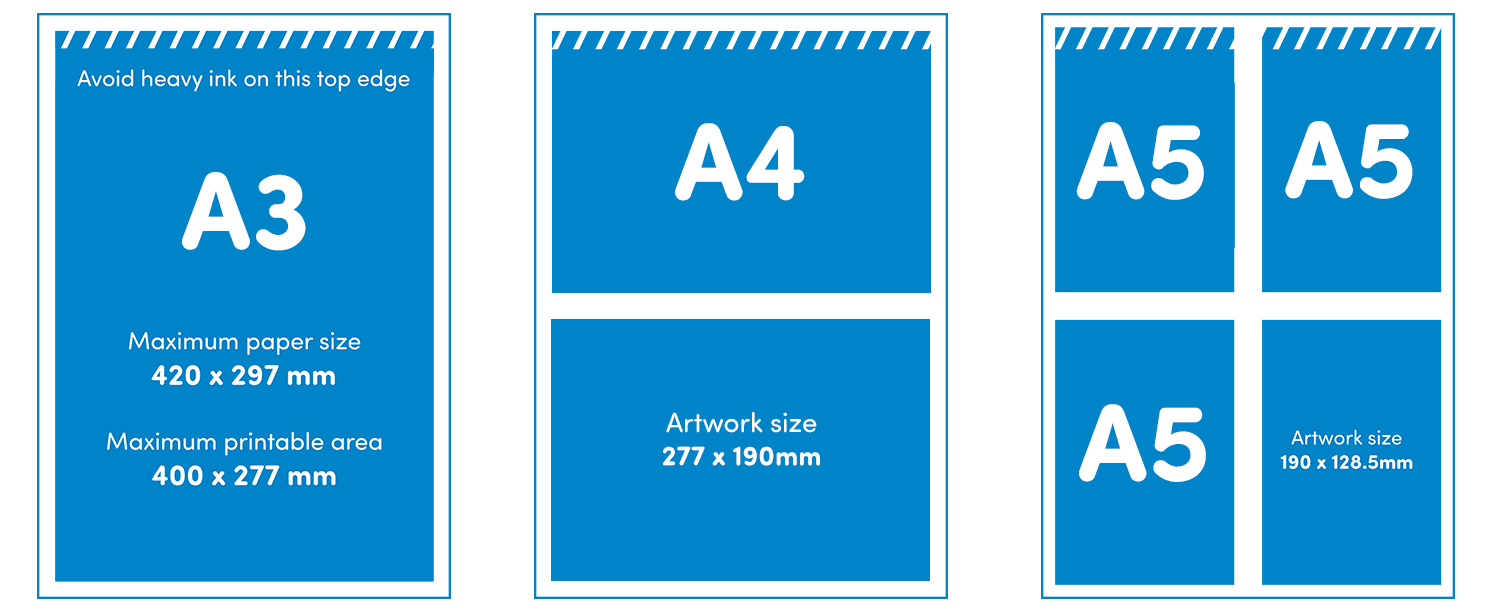
Plan your project with the size first in mind. Maximum finished sizes for books both with and without bleed:
“A4”
With bleed 202 x 281 mm
Without bleed 207 x 291 mm
“A5”
With bleed 140.5 x 199 mm
Without bleed 145 x 204 mm
“A6”
With bleed 99.5 x 137.5 mm
Without bleed 102 x 142.5 mm
︎ Keep a blank 5mm margin (also called grip) around all the edges of the A3 because the Riso can not print right to the edge of the paper.
Color Separate Your Artwork

Part of the magic of RISO lies in the layering and creative use of colors, as well as adjusting opacity to make the most of single colors. With Riso inks, the idea that “less is more” often rings true. Using just 1-2 colors can create striking effects, while 3-4 colors can expand the range and even approach a CMYK-like quality for photo-realistic prints.
︎Send us greyscale PDFs (300dpi or preferably 600dpi).
︎ Each print color must be a separate file in greyscale as shown above.
︎Send us a color preview for reference.
︎ Check out this video for a tutorial on how to set up your files and use color separation in Adobe Photoshop or Illustrator.
Create Pagination (for booklets)

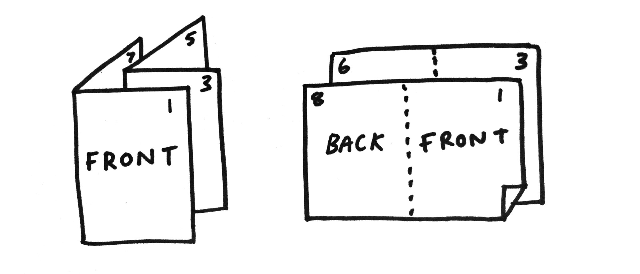
We recommend making a physical mockup of your booklet for yourself to make sure all your pages are in the right place on the print sheets.
You can use spectrolite.app to create the printing layout or alternatively you can use these PDF templates.
Advanced Tips
︎ For type, vector images, and line art, avoid flattening your PDFs for better print quality. Do not use Adobe Photoshop for text layout—it distorts text vectors. Instead, use InDesign to combine text with Photoshop raster images and Illustrator vector art for optimal results.
︎You can use the simple and free software spectrolite.app to help with color separating your artwork or creating the print-ready pagination for your zine.
︎Heavy ink coverage in your design can increase the chance of jams, roller marks, or mechanical errors. To avoid this, use textures, gradients, or reduce color opacity to 90% or less.